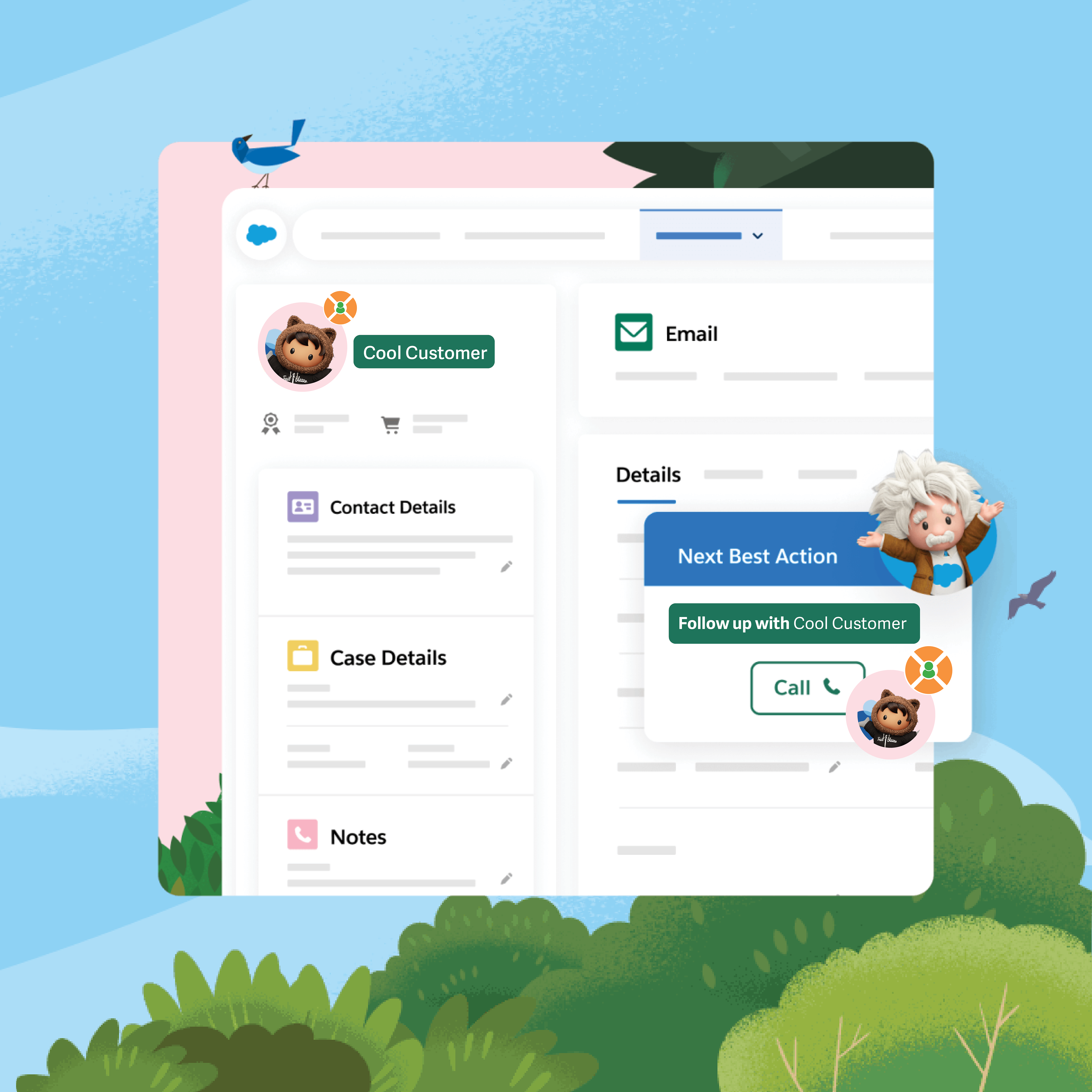
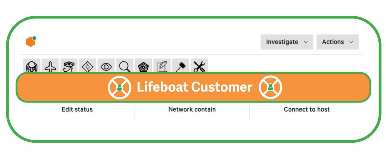
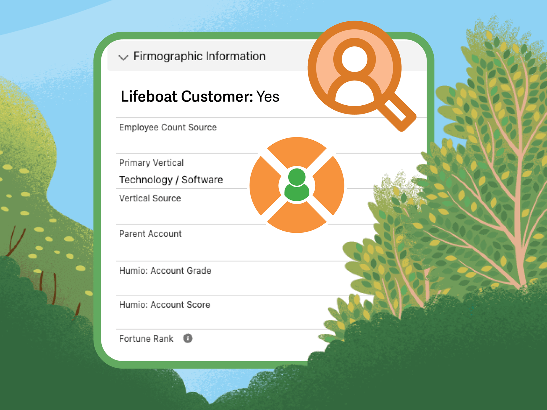
What is Lifeboat? Lifeboat is a cybersecurity feature for Salesforce that my team at CrowdStrike and I built for analysts to rapidly identify critical infrastructure customers in case of an urgent event. For an enterprise software company with thousands of customers, analysts need the ability to visually identify essential customers (911 dispatchers, hospitals, etc.) in the event of an emergency response scenario. Our Lifeboat feature includes icons and other visual elements that highlight these customers in Salesforce and other internal applications that analysts use every day.
What was my role in the project? As the visual designer for Lifeboat, I studied the existing tools and user interface of the Salesforce platform and other proprietary tools that analysts at the company use. I developed UI elements for the feature, including the lifeboat icon and other in-app icons to represent healthcare customers. I visualized the user interface for how the feature is integrated into different platforms. My global team at CrowdStrike included a Senior Threat Intelligence Analyst - Counter Adversary Operations (Germany), a Digital Forensics & Incident Response Analyst (England), and a Technical Recruiter (Greece).
In addition to working as the team's visual designer, I led the team's marketing efforts as we competed for monetary prizes in a company-wide innovation competition. I led creative communications across internal Slack channels, writing original ad copy paired with creative visuals that engaged audiences.
How did we design the feature and the visual identity? My team designed the features based on the real life, daily workflows and challenges that analysts face, especially during urgent events. By designing based on the actual interfaces and tools that analysts use, we were able to create a true-to-life product that benefits people on-the-job.
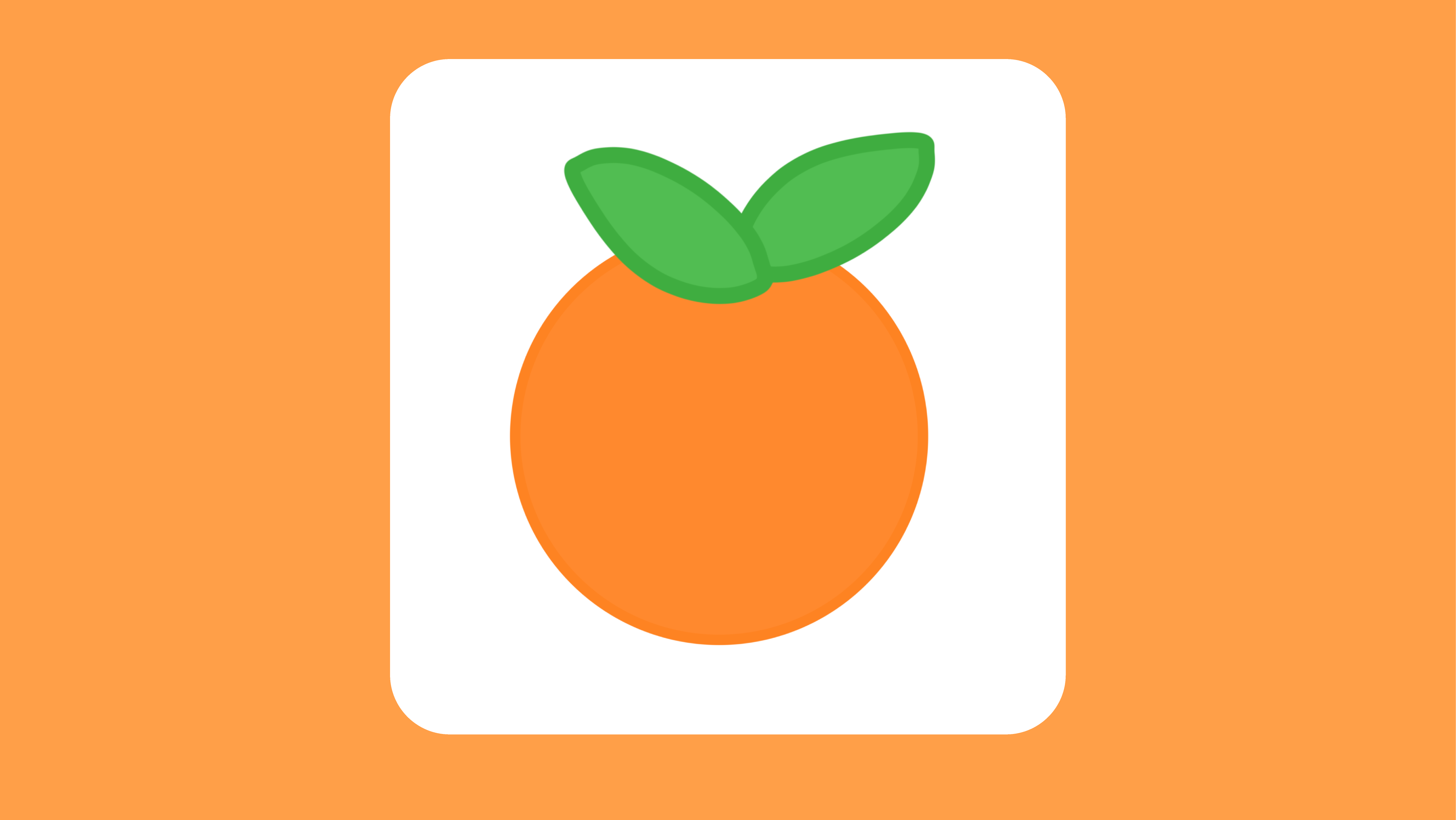
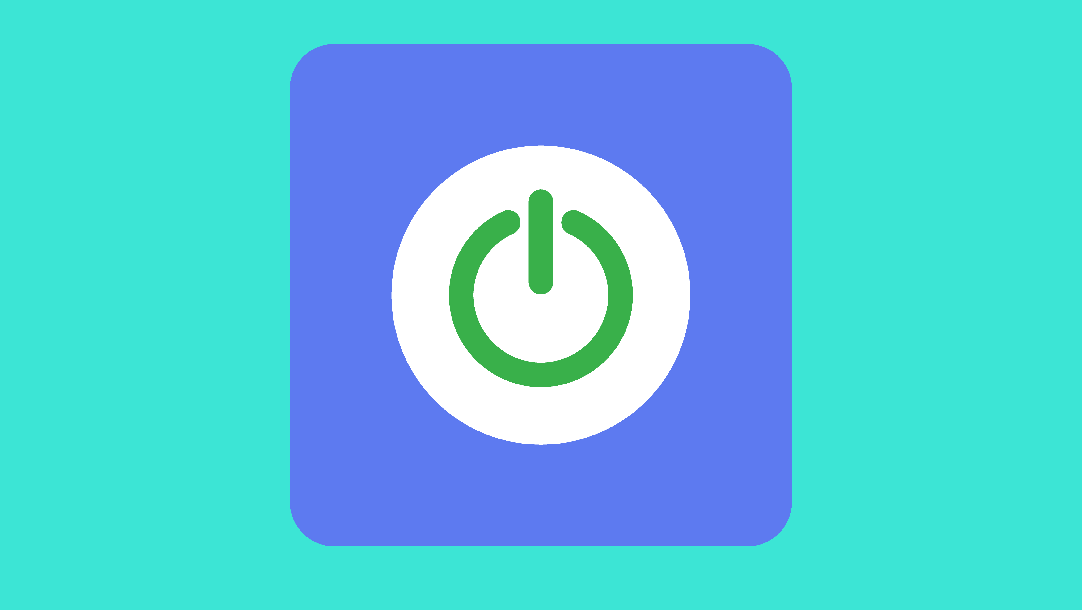
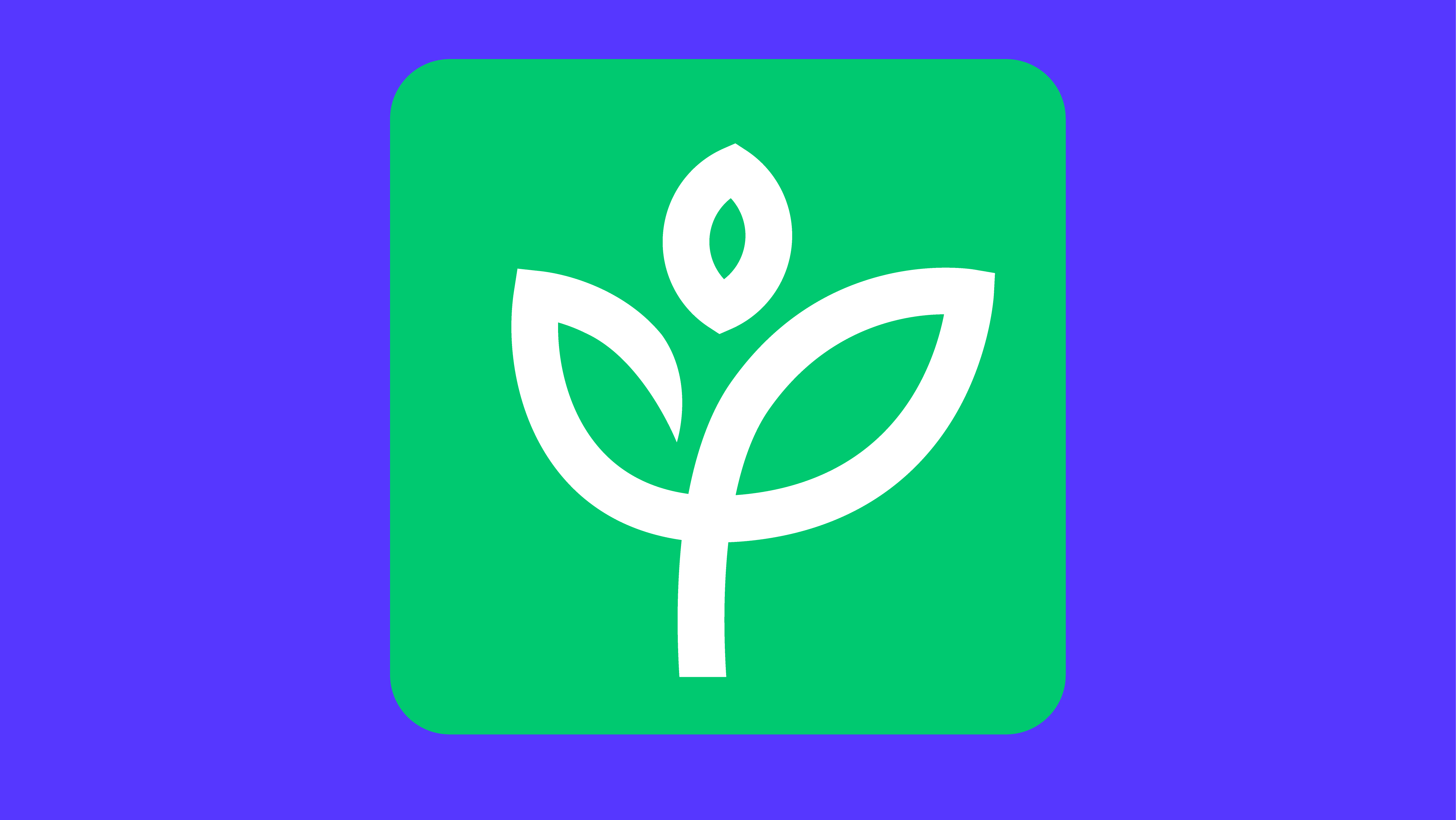
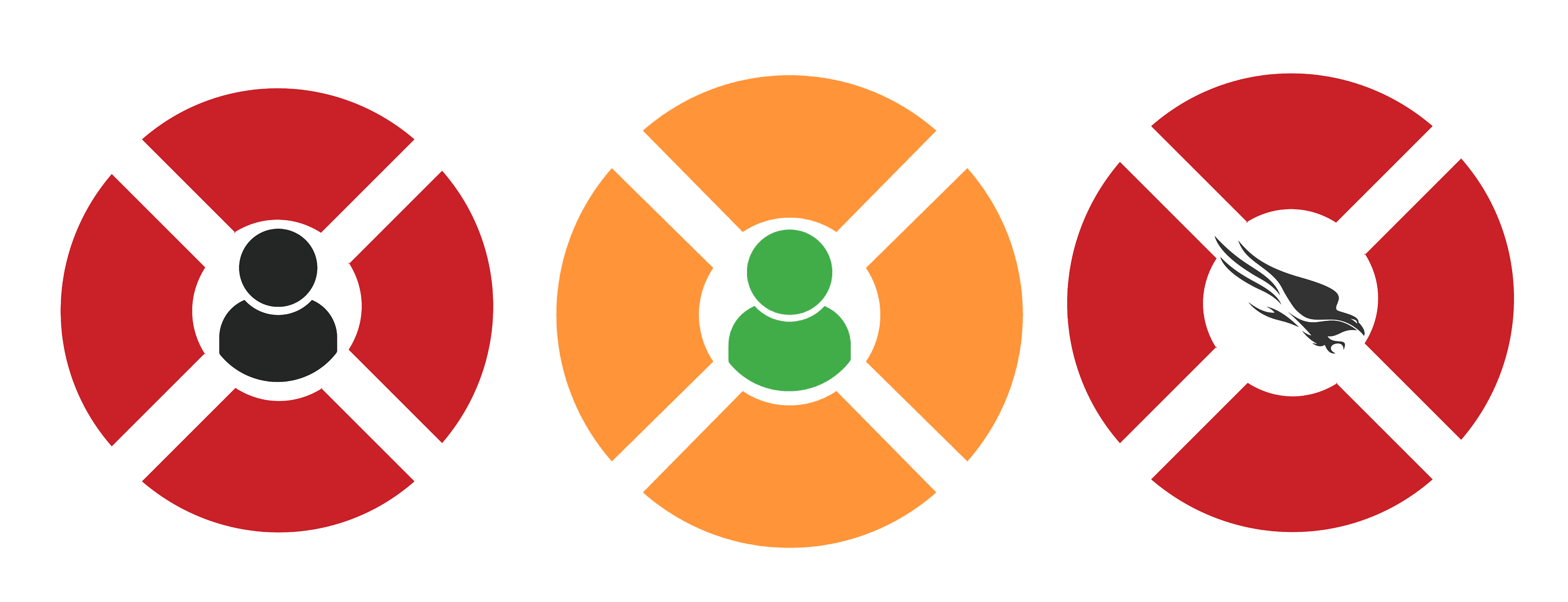
For the visual identity of the icons and tools, I started by researching different icons for lifeboats, rafts, and safety. I chose to create a lifesaver icon, instead of an actual boat or raft, because a circular lifesaver clearly communicates our feature's purpose. I've learned that, in design, not everything has to be literal (a Lifeboat feature can be represented by a lifesaver icon, instead of a boat). I began creating in colors that naturally made sense to me as a designer: orange for a life raft and green for a customer. My team arrived at the consensus to change the colors to CrowdStrike's brand colors (red and black). The team then voted to change the person icon to a falcon icon (one of the company's icons).
How did it go, and what's next? My marketing campaigns and visual design directly contributed to our team earning the support of 110+ sponsors and receiving the top 10% off coins, as voted by a company of 10,000 people. My team earned a finalist spot (top 12 out of 100+ teams and 300+ people) as selected by the Executive staff at CrowdStrike.
There's a possibility that my team's innovation will become a fully realized and integrated part of a company of 10,000+ people that protects 62 of the 100 Fortune 100 companies!
After the competition, the Executive staff at CrowdStrike personally reached out to me to invite me to be a part of a new innovation initiative at the company. I would have loved to have accepted their offer, but my internship only had a few more days until it was completed. Even so, I was honored to receive their invitation and be recognized for my design ability, team work, and passion for protecting people and businesses.
Skills: visual design, product design, agile teamwork, UX design, cybersecurity, channel marketing, marketing analytics, user research, creative writing, product demos
Software: Salesforce, Slack, Sales Cloud, Adobe Illustrator, Adobe InDesign, Figma